Project 2, "The Tireless Wheels"

This was the result for Project 2: Cutting Line . Laser cutting is not a forte of mine by any means, but this was actually quite enjoyable (when the laser printer decided to work with me and not against me). The inspiration for this project was when a friend of mine was drifting his car and a tire popped mid-drift but continued to drift on 3 tires and 1 wheel. Either he was brave or just stupid but he simply said "A wheel without tires is just a tire made of wheel." I don't know what he was on but okay.
I wanted to create a set of conditions that resulted in a circular cutout, so all my instructions will be here if you want to try it out for yourself: Instructions
The connection between the two figures was supposed to be done with a wooden rod and and some rivets so that the contraption could spin easily but I'm not a carpenter so I decided to go with tape and these random things that connect like legoes. It gives it this "it's broken but I tried to fix it and it's still broken" aesthetic and I love it so I'll pretend it was intentional. And one final thought, this project wasn't as enjoyable as project 1 mainly because I really didn't like using Illustrator. It didn't work with me and I was getting annoyed at it. And vector art is hard too, I'm a way bigger fan of raster art.
Project 3, "I'll Catch You"
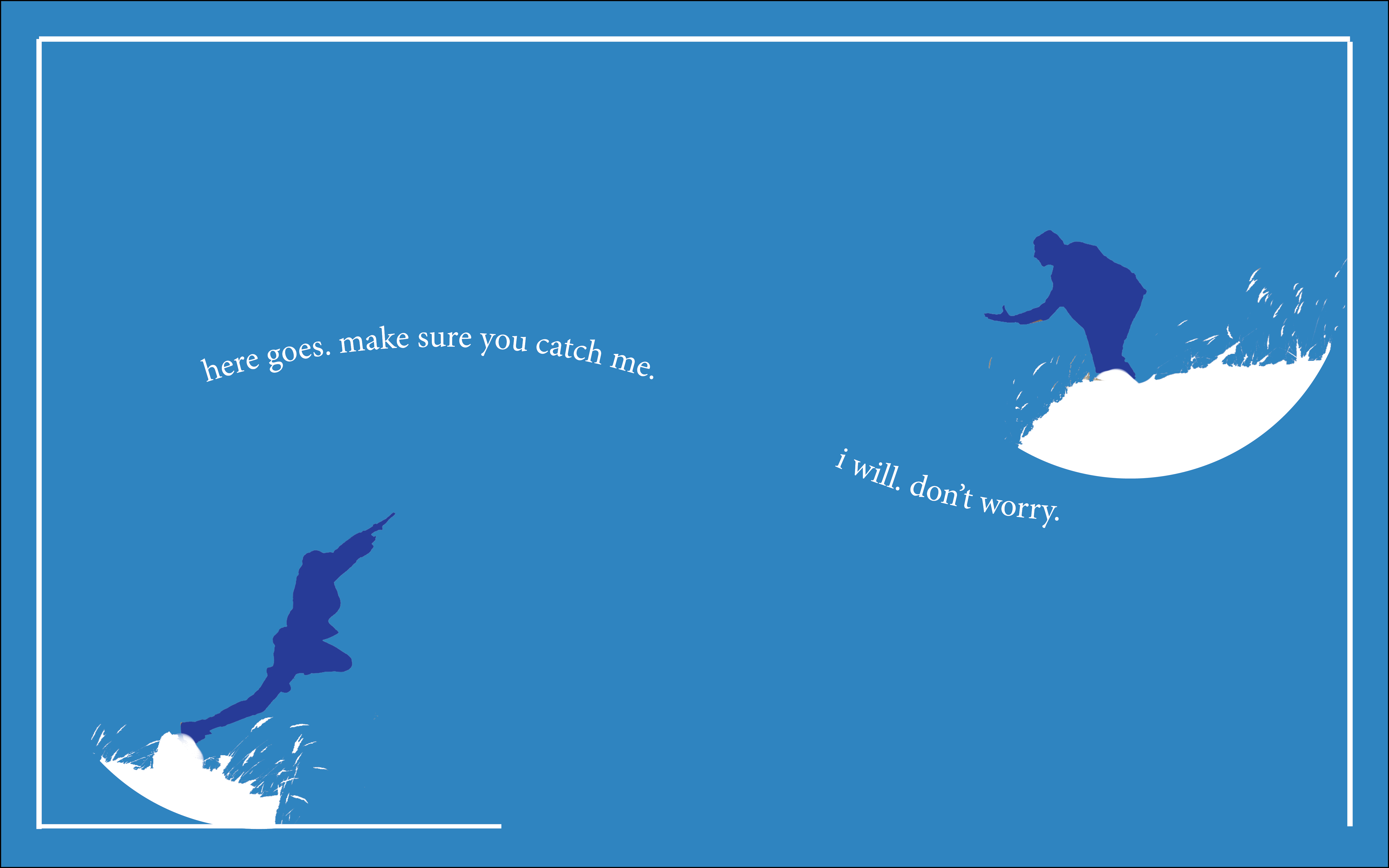
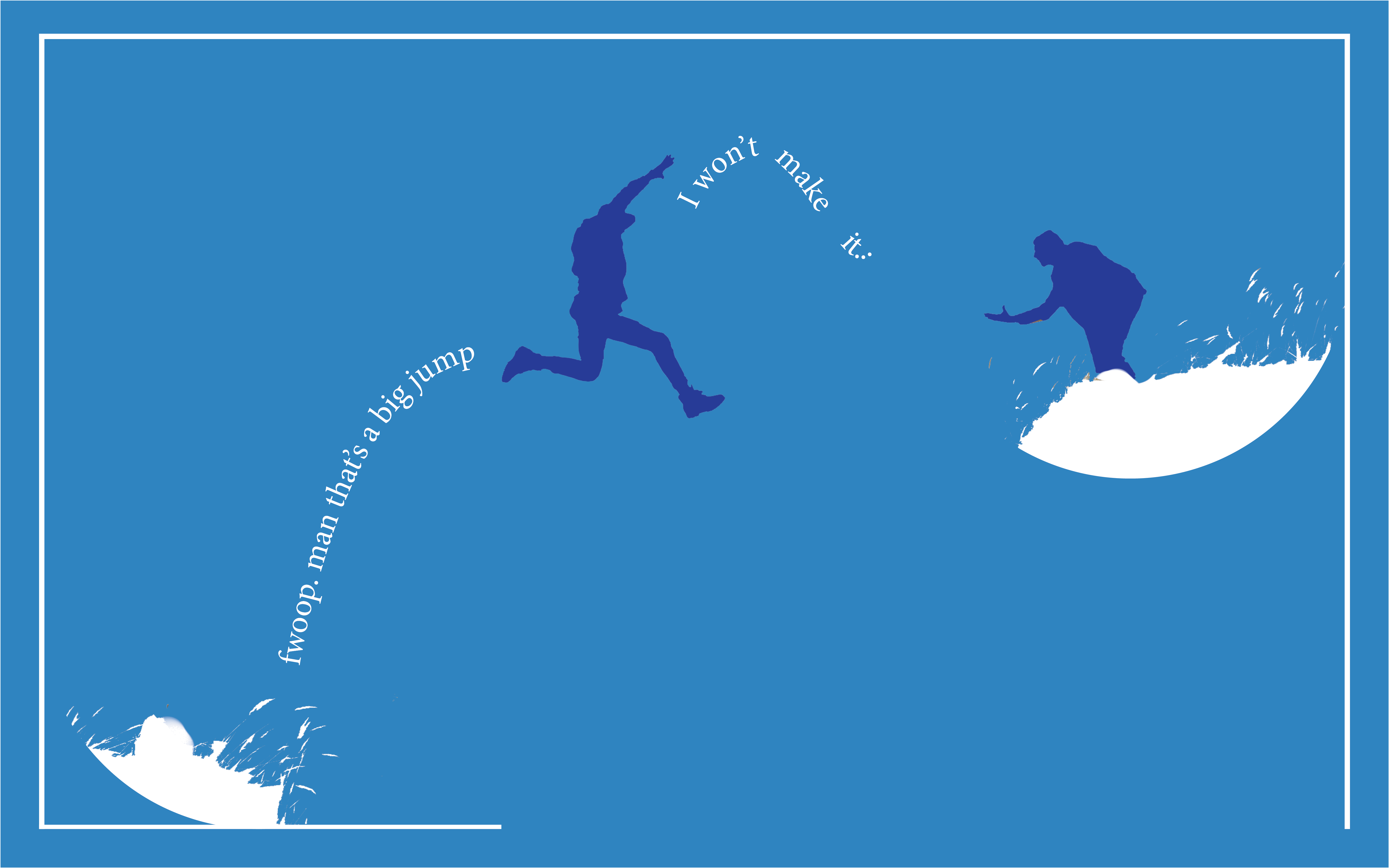
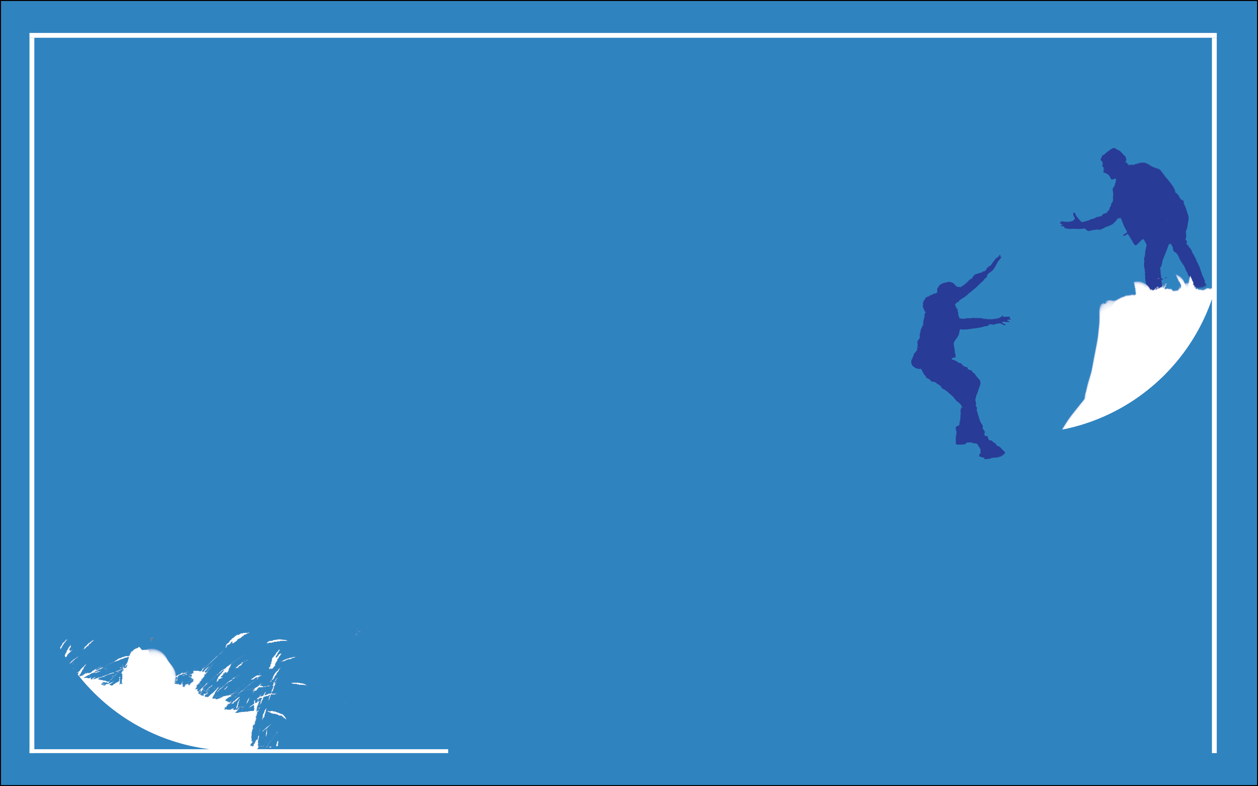
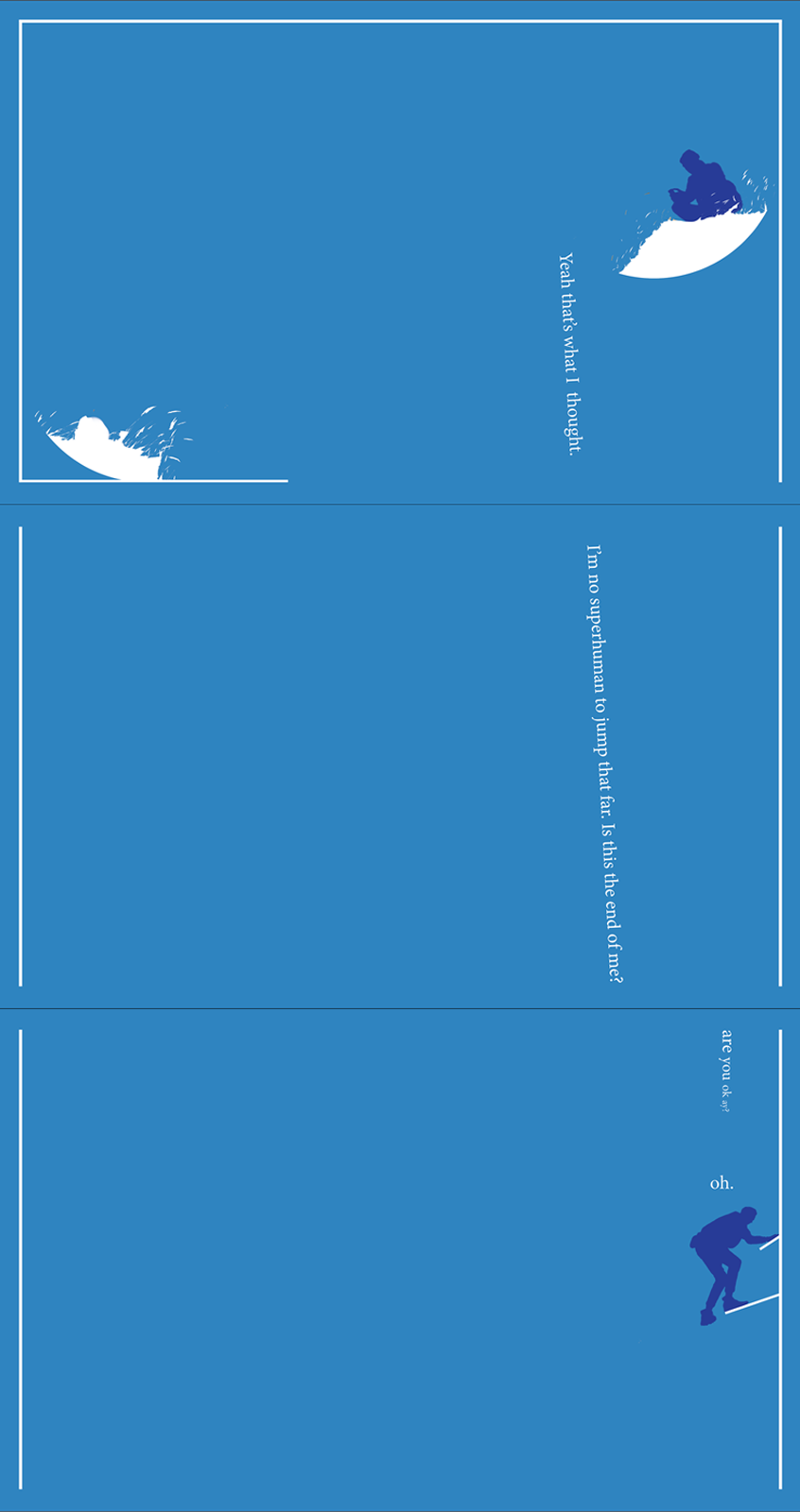
In this project, nothing can be original. Everything here (except for the broder lines) was copied or altered from an image online. The text was part of a ChatGPT prompt where I asked it to write a story of two friends trying not to die. The font size was small so that the empty space is larger and would create a greater sense of danger for the person jumping across the chasm. The last three pages would be stacked instead of flipped so that the story visuals are expanded and create distance between the starting point of the jumper. In the end, it's not my greatest work. InDesign is a software I'm not really enjoying and it's kind of janky. Photoshop is still my preferred software and despite it serving a different purpose, I would enjoy working with it more since all the pages can be stacked on each other so I can better figure out the illusion of movement. Anywho, that's the end of a rant and next up is the final project.
Final Project, "The Train Ride"
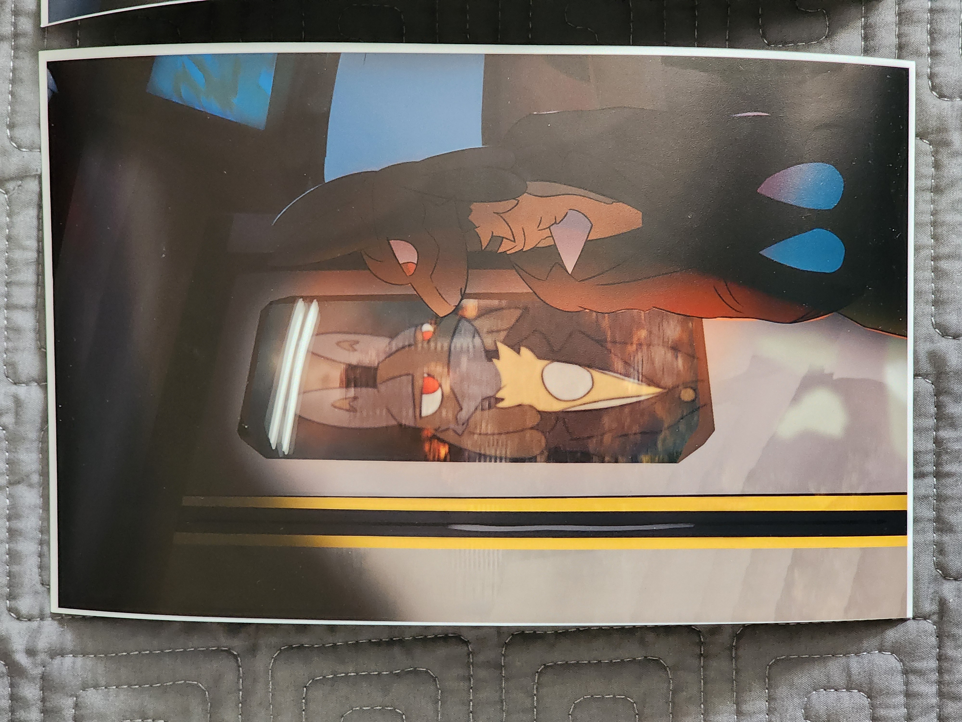
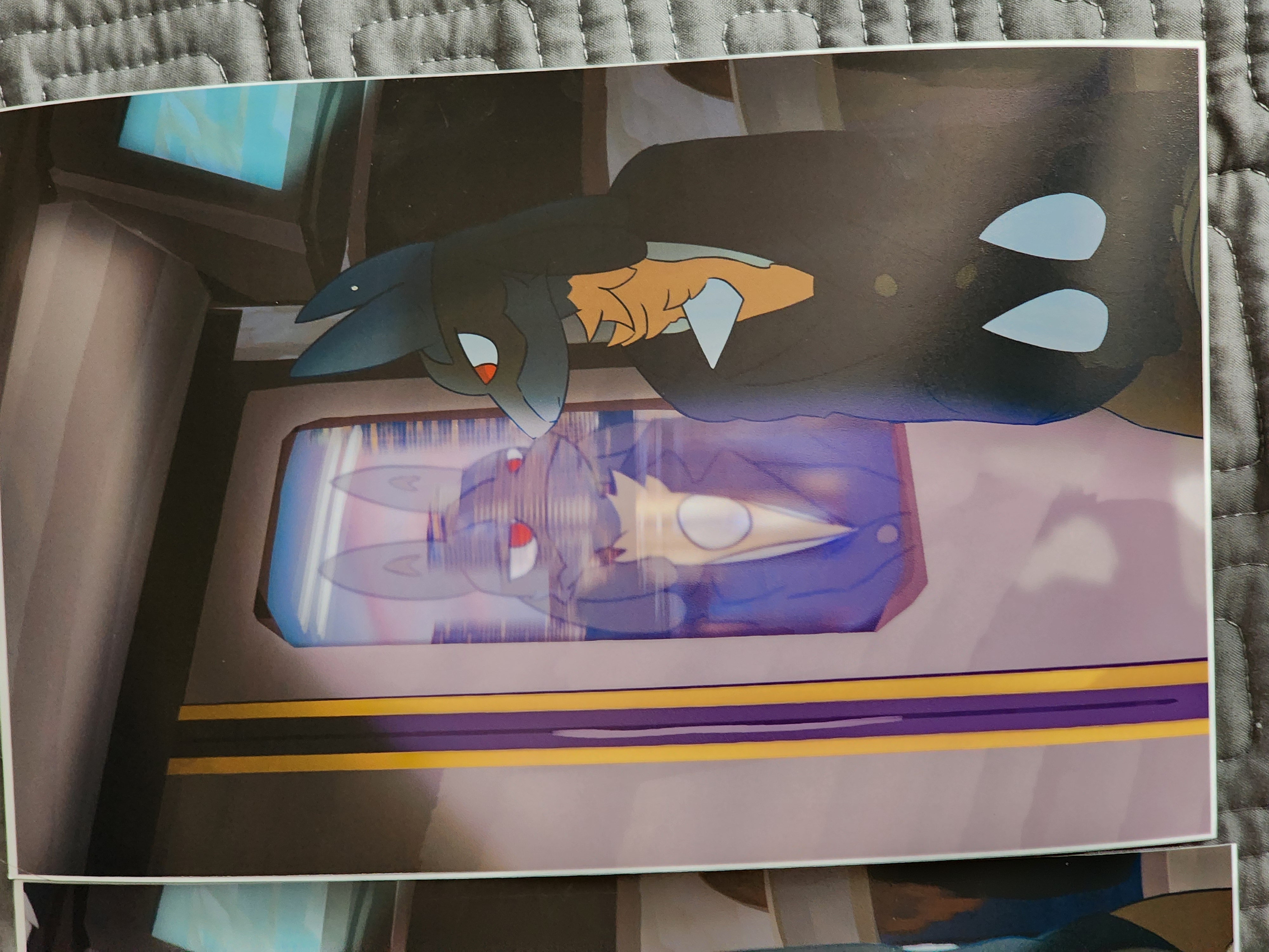
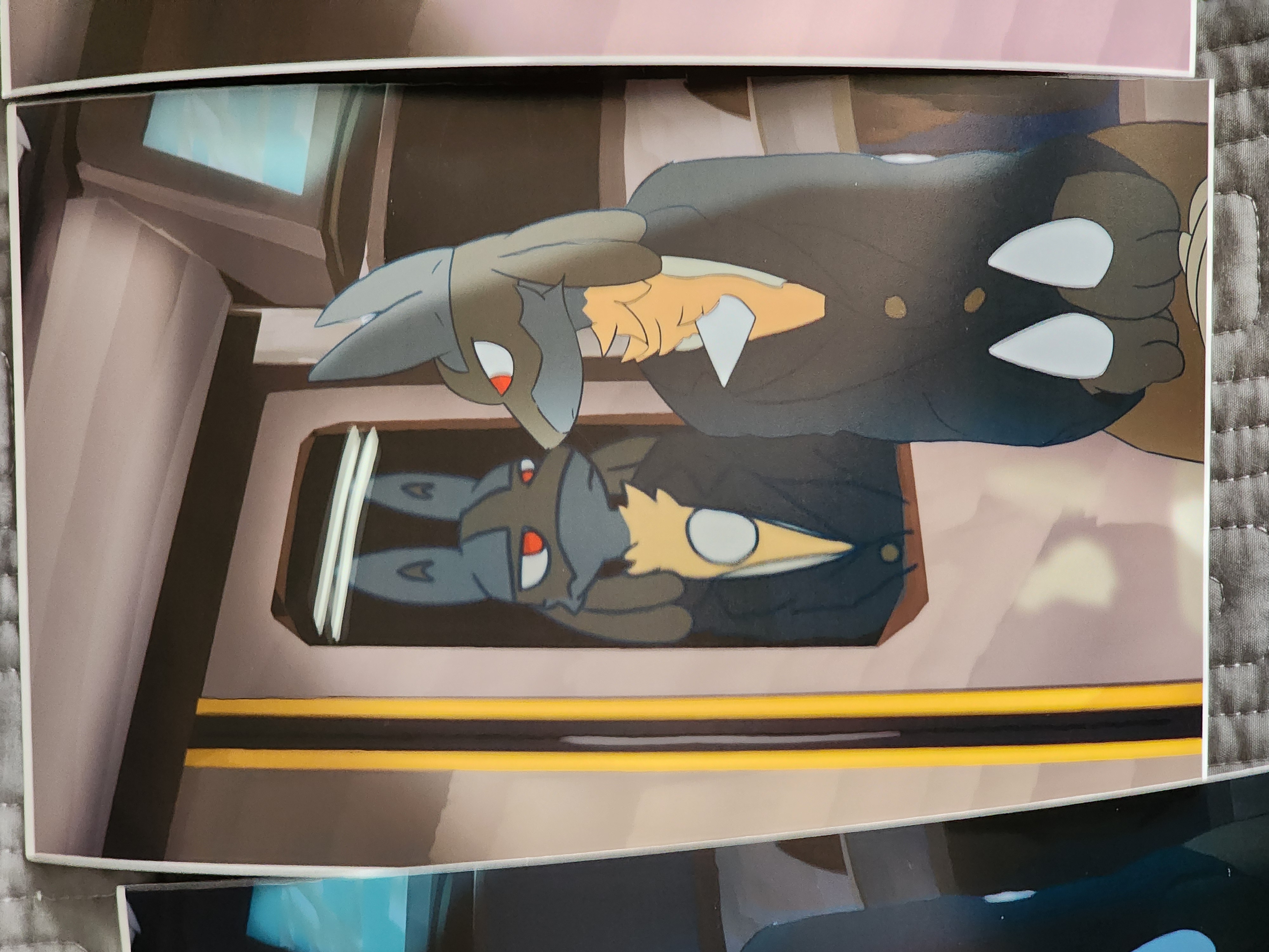
This is my final project. I wanted to bring it full circle, so I decided to create a project centered around project 1. The lucario is still here, jolly as ever, I focused on lighting again, but this time, I wanted to challenge myself and try two new things. First, digital painting. I've never done this before, I've only ever just colored using the basic brush tool where opacity stays at 100%. Painting is not for the weak. Second, I tried to animate a little. Never done this before as well, so this was definitely choppy. But for my first try I don't think I did too bad. I like how it came out. Very me in my opinion. I also printed out each important frame. Glad I took this class. I actually pushed myself and did things I didn't expect I'd be able to do.
___________________________________________________________________________________________________________________________________________________
this site is still incomplete and barebones, please bare with me. html is actually hard 😭
also, hmu on instagram fr @quite_bizzy or @kinda.bizzy
